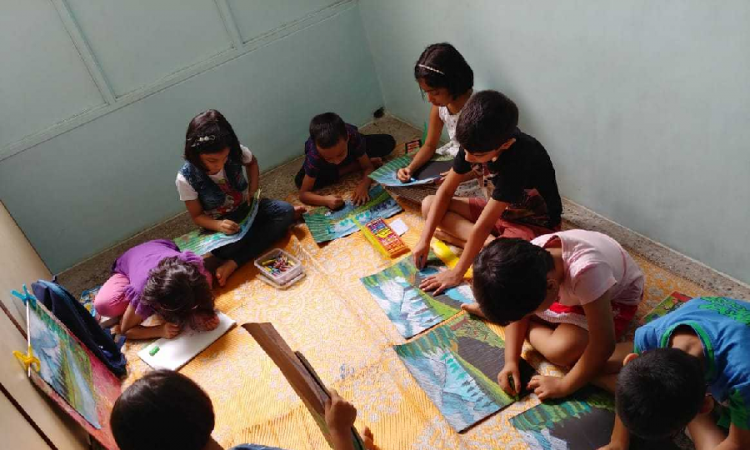
Art is a piece or the embodiment of works done skillfully either through painting, drawing, sculpturing beautifully to express important feelings or ideas. Art also is a craft of creative imagination put down in lines, colors, shade and perspective. Color is a phenomenon of light or visual perception that differentiates an object from another with a striking effect of light and hues. To know more about colors, it has been charted on the color wheel and we divide all colors into three which are the primary, secondary and tertiary colors. Primary colors are natural colors and no two colors can be mixed to get these colors, they are red, yellow, and blue.
Art color is the harmonious coming together of two or more colors to give a satisfying, subjective, unique and effective response to the eyes. We can also see it has a play of colors to give a soothing feel yet provoking a sense of beauty to the eyes.
In this article our focus is more on art colors and we will talk deep into it to show some beautiful works the art colors have birthed over the years. These colors stay as colors that beautify our immediate environment, houses and clothes we wear.
The secondary and tertiary colors come right under this category of art colors because to get a secondary and tertiary color it involves mixing two primary colors in equal measurements together to form another color, a good example is mixing yellow and blue color to give GREEN. Also, with tertiary color it’s the mixing of equal part of a primary and a secondary color together to get such color.
Art color cannot only be achieved by mixing colors alone. They also have peculiar rules that guide their formation and operation. Some of these rules are color values and color scheme. In art color this two play a very important role, let’s check out what they are about.
COLOR VALUE: In art color, color value is a determinant factor to tell how beautiful to the eyes it can be. Color value is the lightness and darkness of a color. The value of a color is known by adding white or black to it, to get lightness of color a touch of white must be added which is known as tint, while the darkness is achieved when black is added which is called shade.
COLOR SCHEME: Art color thrives on this well, because it shows the intelligent placing of colors side-by-side to get something beautiful. Under the color scheme for art color, we have the Monochromatic: this is self explanatory from its name (mono) means one, while (chroma) means color. Monochromatic colors are one color with its tints or shades.
Analogous colors: To achieve this as an art color, colors that are close to each other on the color wheel are placed together, and this gives a very dramatic feel with its output example are red-purple, purple and blue purple. This can be very colorful in a house.
Complimentary colors: In art color this is a combination of colors found directly across each other on the color wheel, this set of colors have a very strong contrast effect. Examples are Blue and orange, red and green. There are other schemes to give an exquisite art color such as Color triads, split complimentary colors, warm colors and cool colors.
